- April 18, 2024

-
-
Loading
Loading
The poet Ezra Pound's philosophy of art was, "Make it new." He said to take the ancient themes and ideas such as love and mortality and give the reader a new look at them. Making the themes new make them relevant and entertaining and instructive again.
It's human nature to gravitate toward the "new." We want to know the latest information about the people who live near us. We ask each other about our families and jobs and feel a greater connection with each other because we are up to date. We call our weekly collection of "new" information a "new"spaper.
On a more superficial level, newness is also important in marketing. My favorite example is Reese's Peanut Butter Cups. Although the cups are already the perfect candy, the geniuses at Reese's decided to come out with a variety of new versions: white chocolate, crunchy, dark chocolate, mini, big cups, unwrapped, etc. Why? Because new is exciting! And I have bought at least one of every variety.
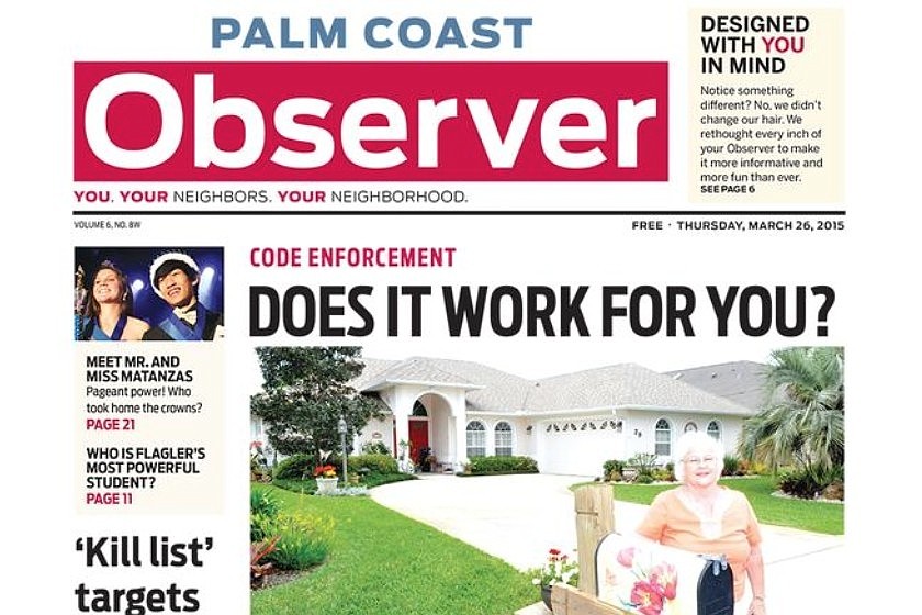
And so, it is with great pleasure that I introduce the “new” Palm Coast Observer. Following the lead of our sister papers in the Observer Media Group, which is headquartered in Sarasota, we have adopted a new look, designed by Pegie Stark, an insightful consultant and designer who has helped us in our latest step in fulfilling our vision statement, to "innovate and elevate."
The design is inspired by Piet Mondrian, a modernist painter whose work is characterized by rectangles of varying sizes and bright colors. We also have new fonts (all of which were designed in the past few decades, which, in the world of typography, is extremely new) and some tweaks in our standards.
For example, photos are given an even greater emphasis than before. We have a new rule: Every face that appears in a photo in the Observer should be no smaller than a dime. If any of you would like to give us feedback on this, I would invite you to keep a dime in on your coffee table or nightstand and scroll the dime from page to page over our photos to see if we are zooming in sufficiently on you and your neighbors. Unfortunately, this new standard could mean that we will need to use fewer photos in print, to allow for the best ones to be larger.
In those cases, we will put the rest of the photos in the online versions of the stories, and we will remind you to visit us there for more coverage. The website and the print edition are seen as two wings of the same animal, and we hope you will see the added value online, as well. For those who submit photos to us for coverage about your clubs and other accomplishments, we continue to welcome your submissions, and we will do our best to provide feedback and even training on how to submit things that will look more successful in print, if you so desire.
In the new design, we also will spend even more time than normal on our front page. We see the front as a preview of the very best we have to offer in a given week. If one of your neighbors gives us a great quote in an interview for a story that appears on Page 25, we may put the quote on the front page and encourage you to then turn to the full story for the context.
This is a new era. The previous design has been in use by the Observer Media Group for more than a decade, and it has served us well, winning numerous awards in state and national competitions. But we trust that the new design will be even more engaging and will facilitate even more effectively our efforts to transmit the latest and newest things happening in your neighborhoods.
Let me know what you think and what other things you'd like us to be writing about. Email me at [email protected]. We thank your for continuing to read and support us as we work to make the Observer new each week.